Transforming a brand whilst navigating & preserving brand equity.
For this project to be successful a tight balancing act between getting the correct tone for the target audience, levelling up the overall fidelity of the brand, and not upsetting the status quo.
Designing for a change-averse customer base is difficult, and comes with a unique set of challenges for which research is essential.
Overview
Name:
NutSystems
Industry:
Hydroponics
Project Type:
Brand Refresh / Campaign
Scope of work:
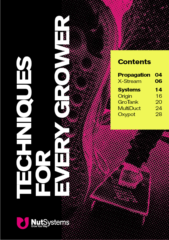
Campaign theme, Asset packs for customers, 7-week email campaign, social media posts for NutSystems channels,
Product Brochure.
Who Are Nutsystems?
NutSystems carries forward a 50-year legacy in hydroponic innovation. Originating with the pioneering Gro‑Tank in 1976, the brand has evolved through extensive product lines and survived challenges emerging with renewed focus.
Research
Findings
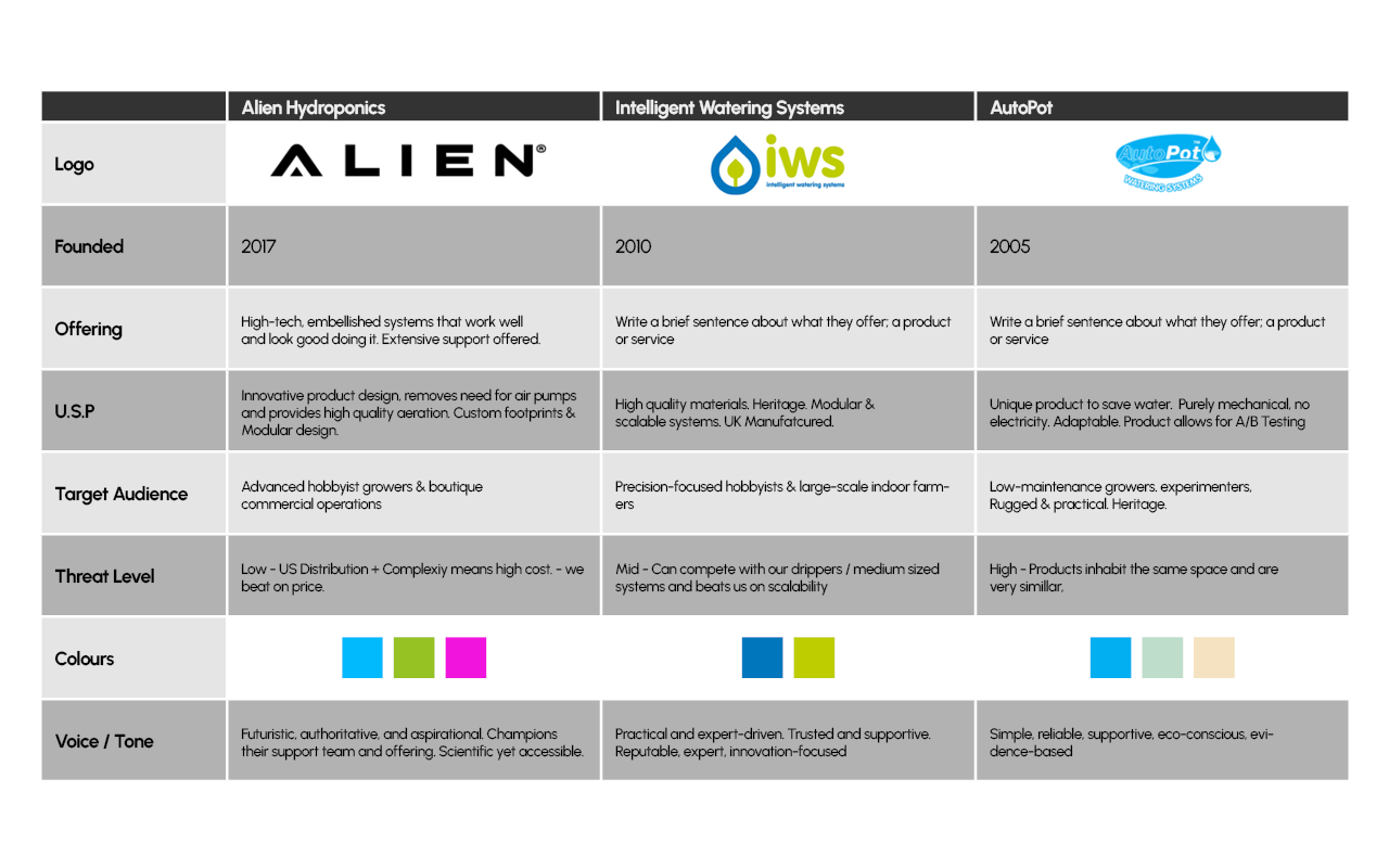
01
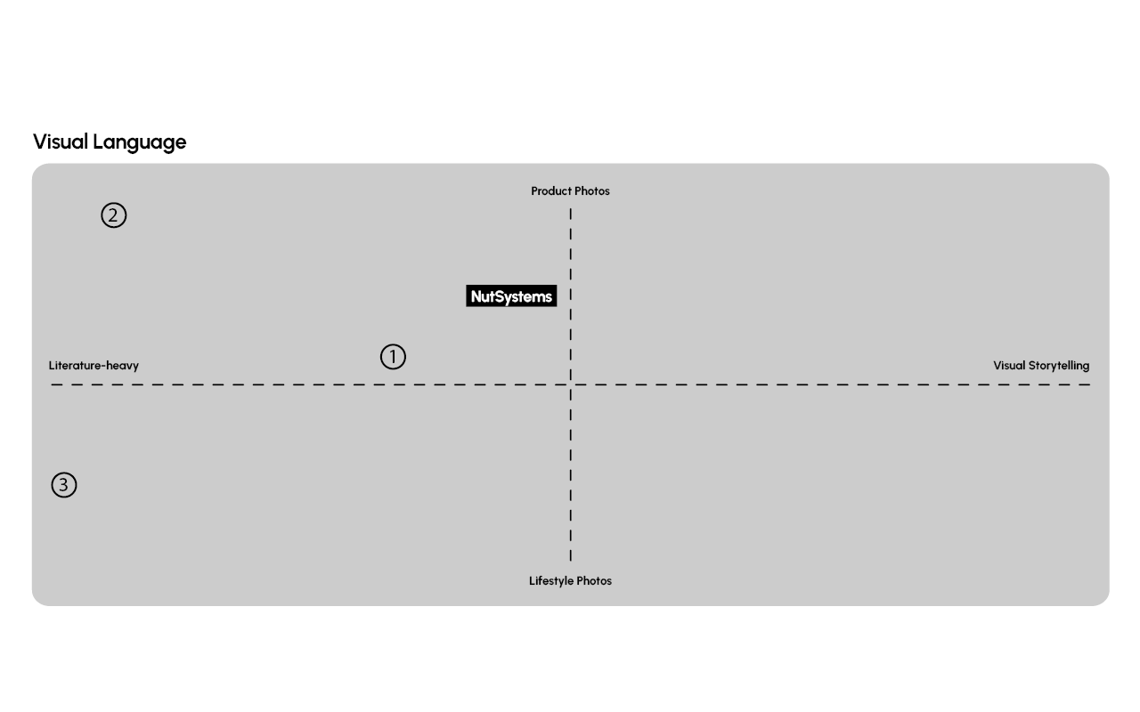
Almost none of these brands, (including NutSystems, to a point) use much visual storytelling, and use simple lifestyle and product photography/renders (Untreated or used as-shot).
02
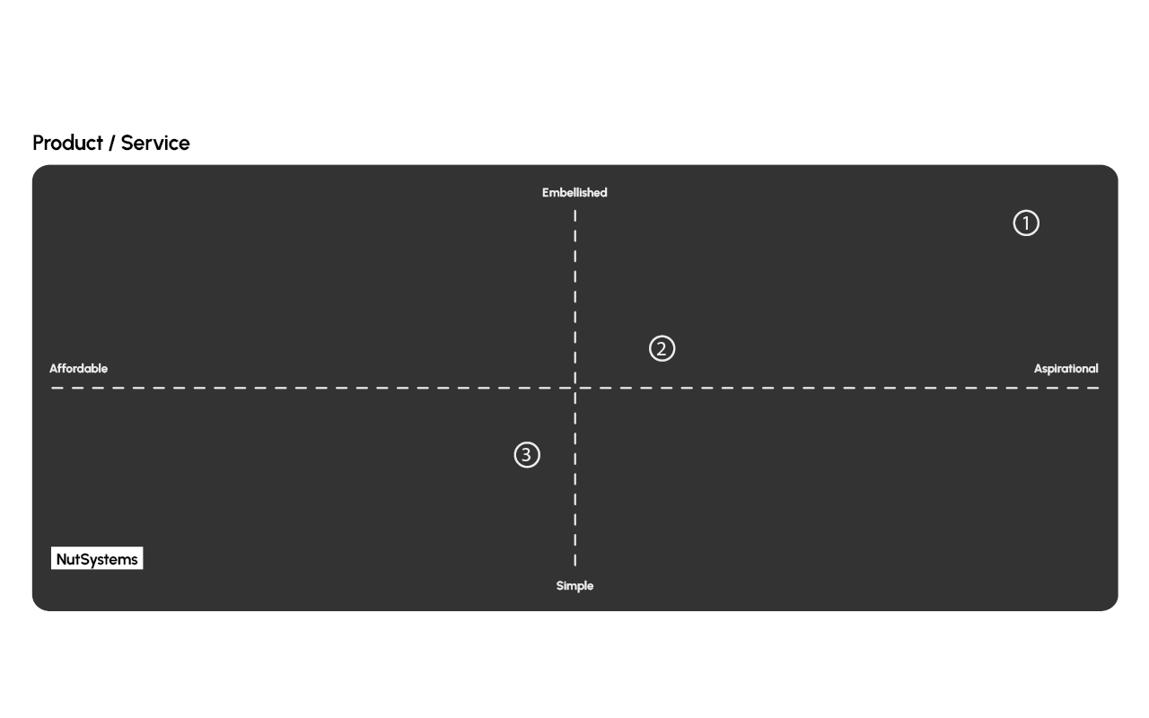
Initial research found that the market is saturated with many products and brands with similar products. There are a few outliers which have done well for an extended period of time, NutSystems being one of them.
NutSystems does a good job visually differentiating from it’s competitors, but shares the same value proposition and tone.
03
While all brands sell products which do the same thing, with vastly different aesthetics, they use very similar tone of voice and colours across their brands.
NutSystems are by far the
most affordable, and have
the simplest product lines
across their competitors.
Refocussing
Messaging & Value
Currently, the messaging and value proposition of NutSystems is about keeping up with competitors, when a better approach would be to focus on what makes NutSystems different.
A worry with doing so is that the new messaging will be lost on customers, and so it is important that the tone of the brand does not change, visually or through the written word.
Differentiating Factors
There are a few things in
NutSystems’ offering that make
them unique to the market:
- Affordable Product Lines
- Compact, singular units
- Simple to use - from beginner to pro
- Reputation
Direction
Areas Of Focus
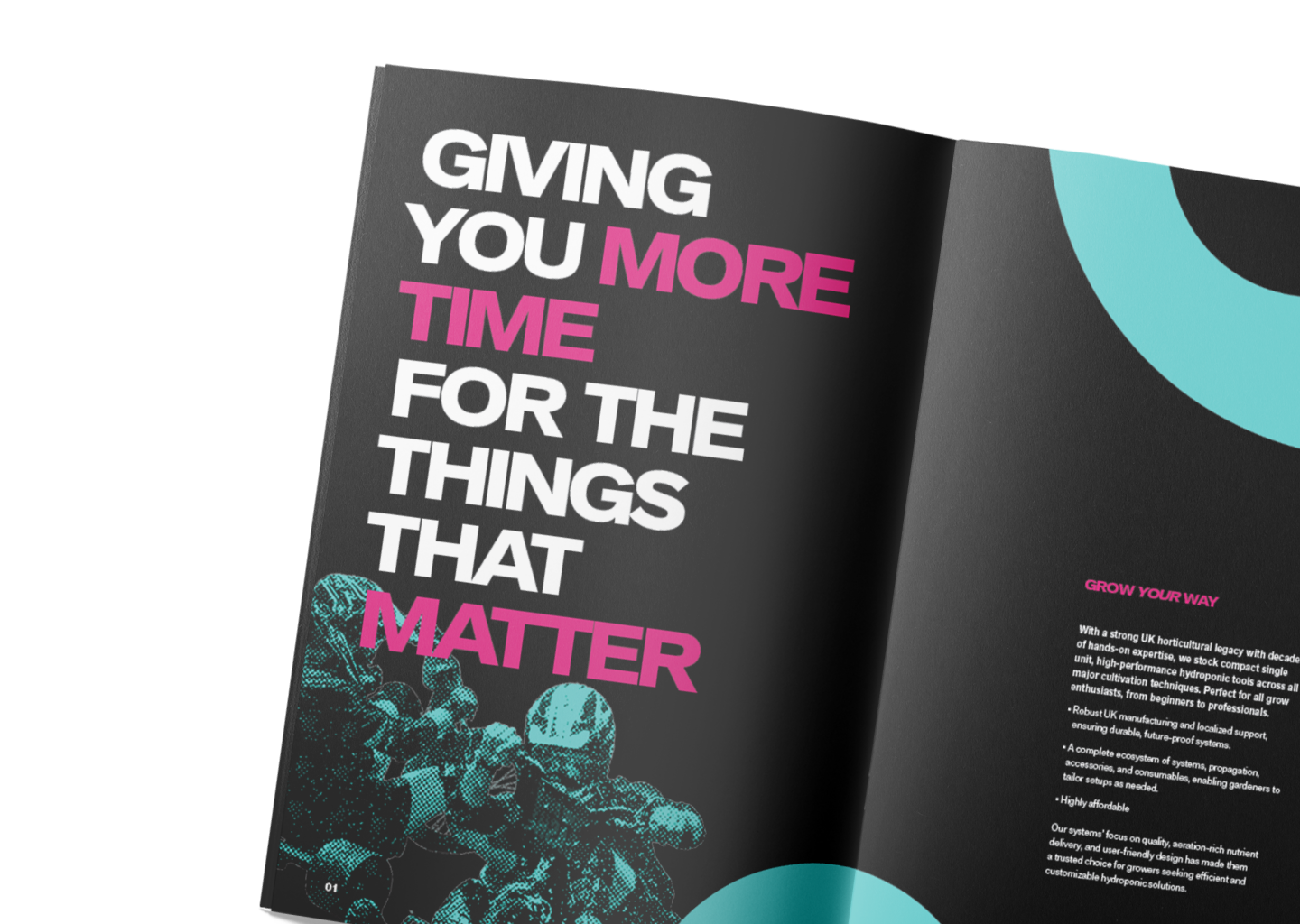
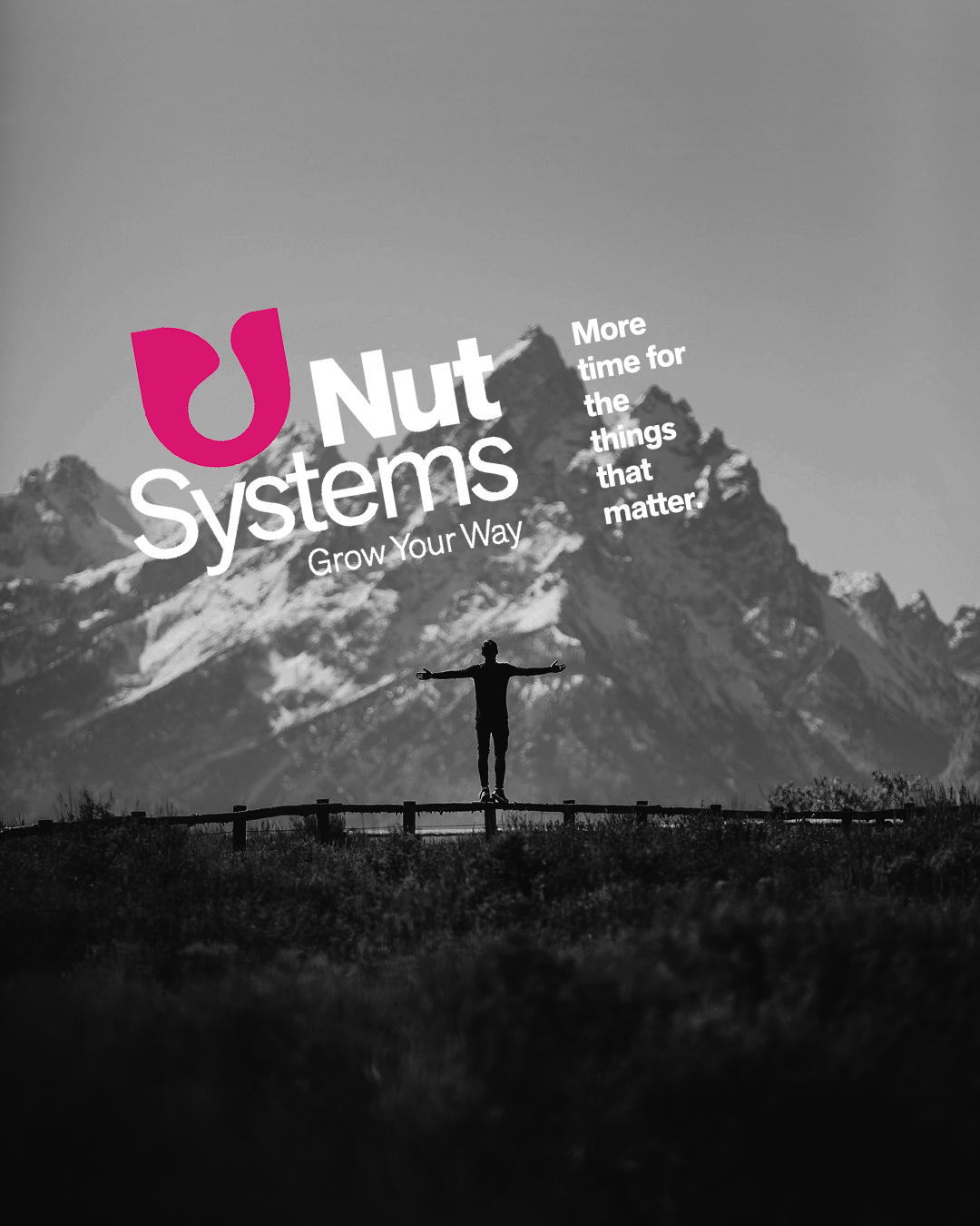
01 - We can create exciting lifestyle images and
videos and use them to tell stories.
02 - Differentiate with colour.
03 - We can remind customers of NutSystem’s
affordability, usability and ease.
Visuals
Collaborating with the owners to create customer personas allowed me to get an idea of what the current market expects (alongside existing visuals & competitors). Customer personas are also a powerful tool when looking at visual direction.
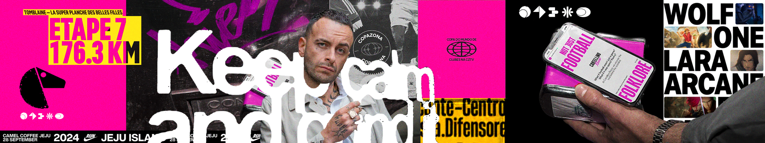

After presenting these visuals to the client, we agreed on taking elements from both, introducing complementary colours and using striking photography that can be, at times, treated to give a gritty and masculine feeling to communications.
After an audit of the currently standing brand, and a conversation with the client we decided to keep in line with the current language, tone and use the same types of imagery and expand upon them. This is to keep as much brand equity as we possibly can, keeping customers at ease as we introduce some new elements.