Finding balance between history and modernity to inspire young audiences
Overview
Name:
Rotherham School Of European Combat (RSEC)
Industry: Historic European Martial Arts
Project Type:
Logo Design & Asset Creation
Scope of work: Logo Design, Brand Collateral creation.
An important part of the logo is the associated name, I intentionally left the name smaller, to be replicable across many different locations as the ambition of the company is to have several locations to operate from, while they only have a Rotherham headquarters at the moment this could change at any time.
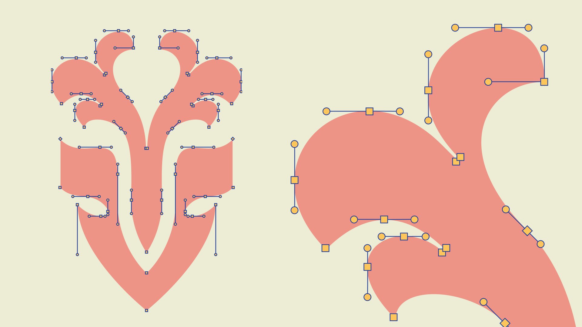
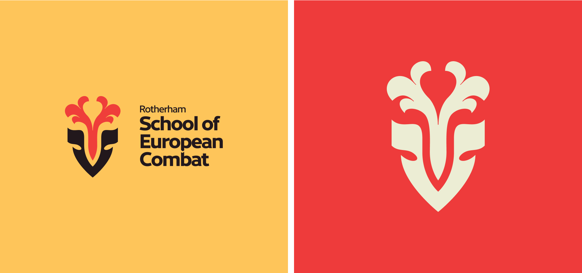
The location is also a big part of the logo. I chose to use a deer motif as that was the sigil of Thomas Rotherham, a significant historical figure. This will inject a twofold historical meaning as it is also the birthplace of the brand.
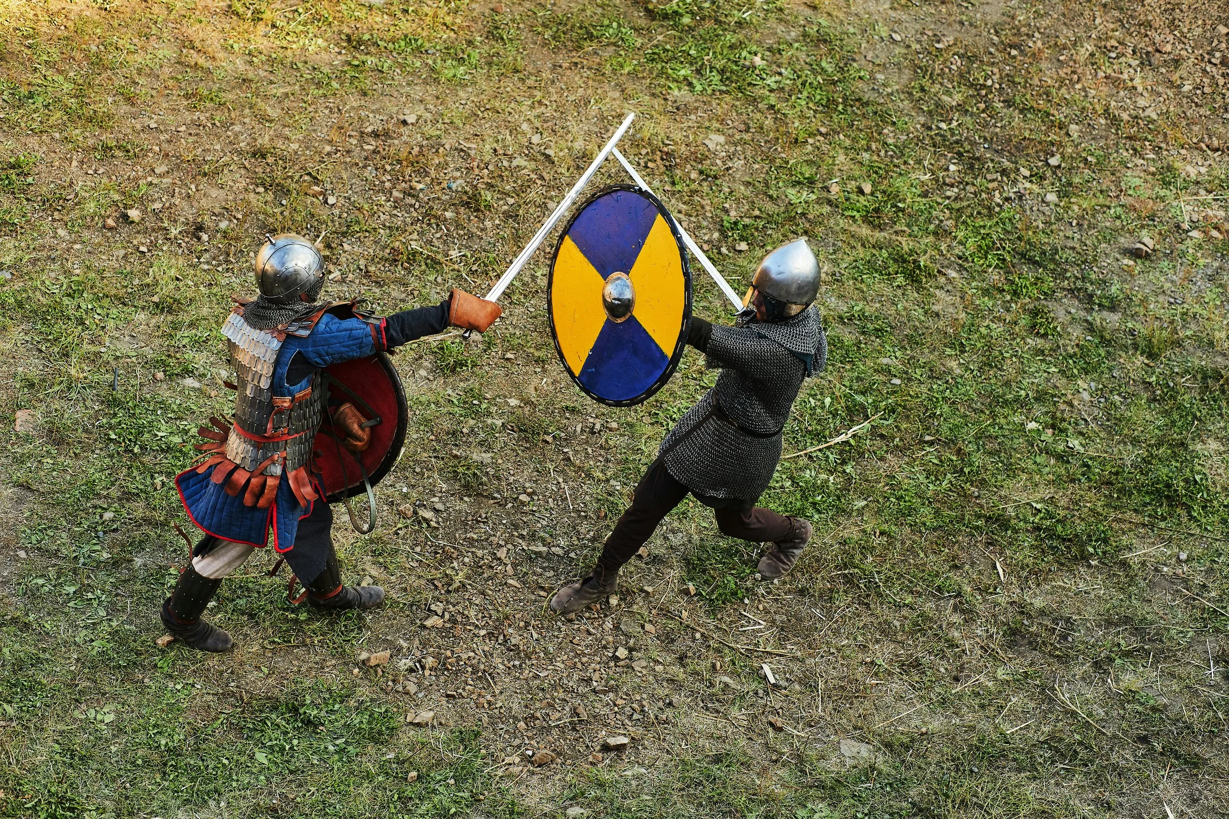
From that starting point, I explored ways to combine elegance and strength, contextualised through the activities within the club and the time period from which they are from.

Medieval Helmet
Deer (Sigil Of Thomas Rotherham)
Medieval Carving
Colours were chosen based on colours that were readily available curing the medieval period, being derived from pigments present in the local flora and fauna of England.
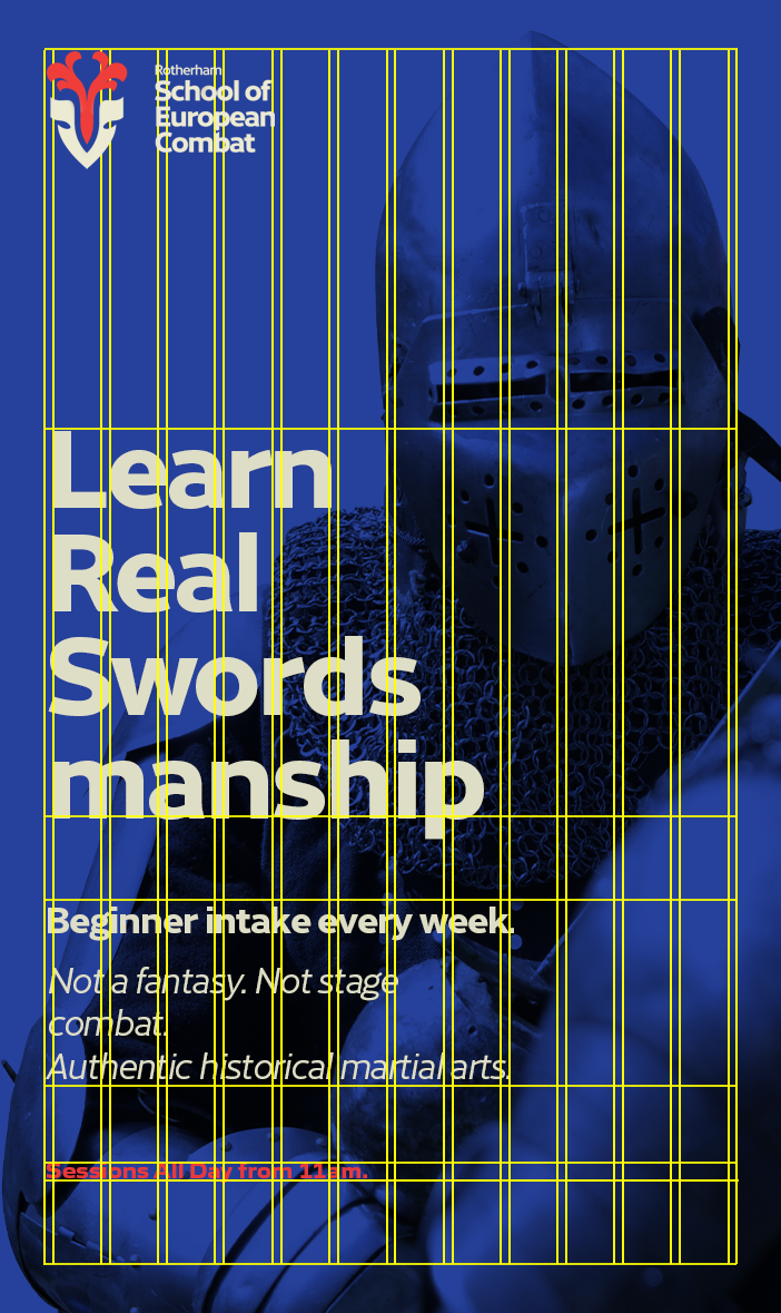
From within those available colours, the more primary colours were chosen as they impart more energy and feeling, and are especially common when it comes to sports, something which builds towards the goal of attracting more of an audience, especially from athletic circles and the younger generations.
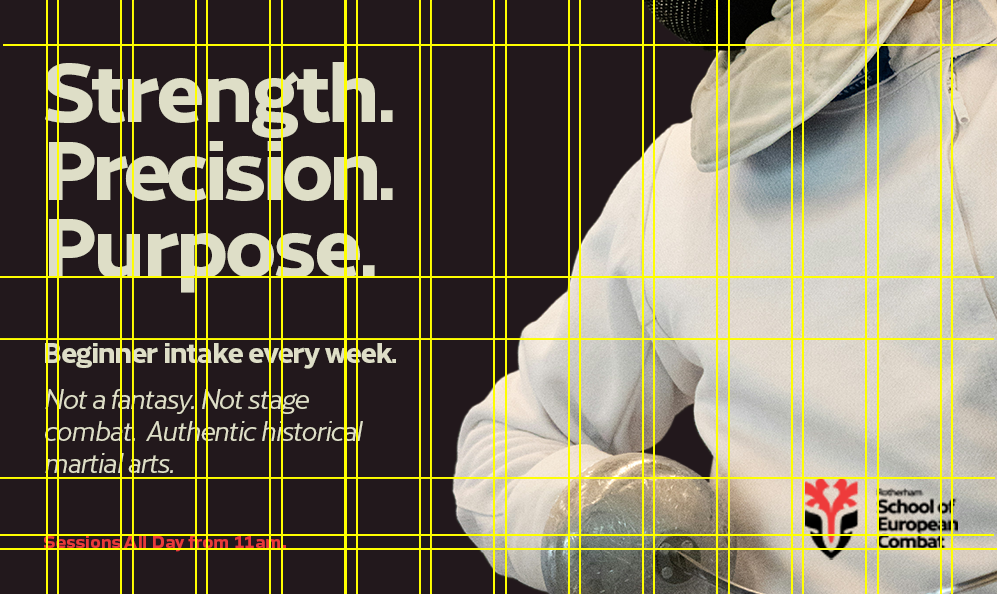
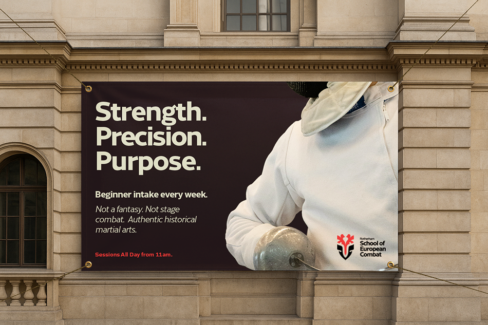
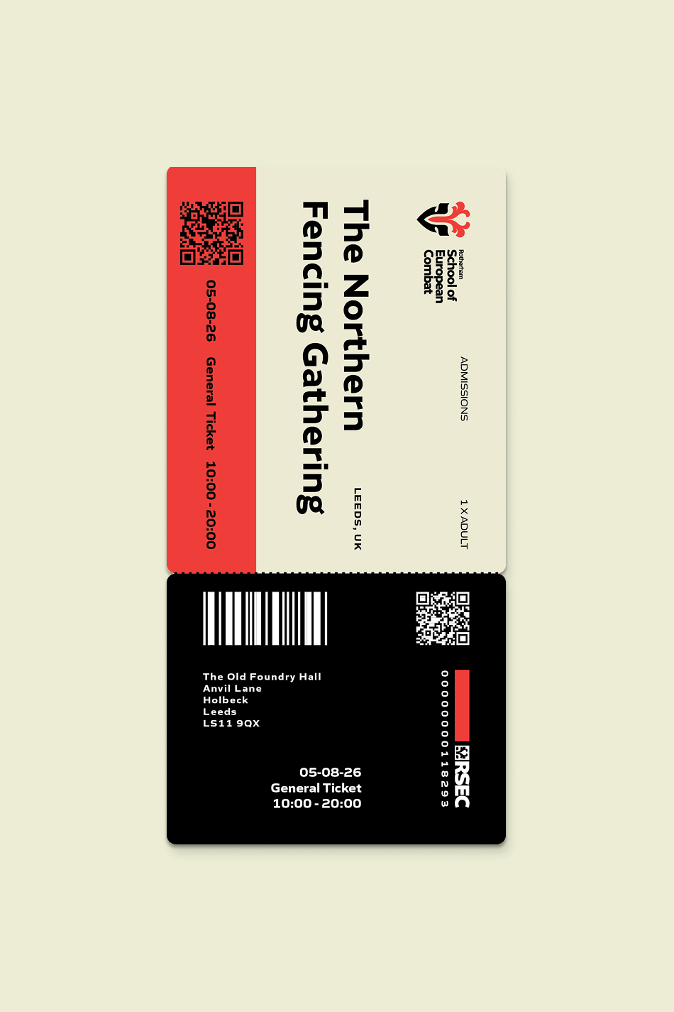
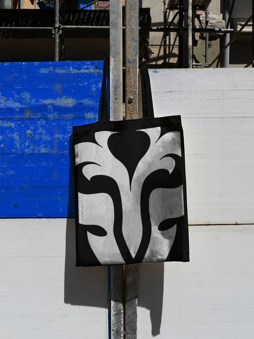
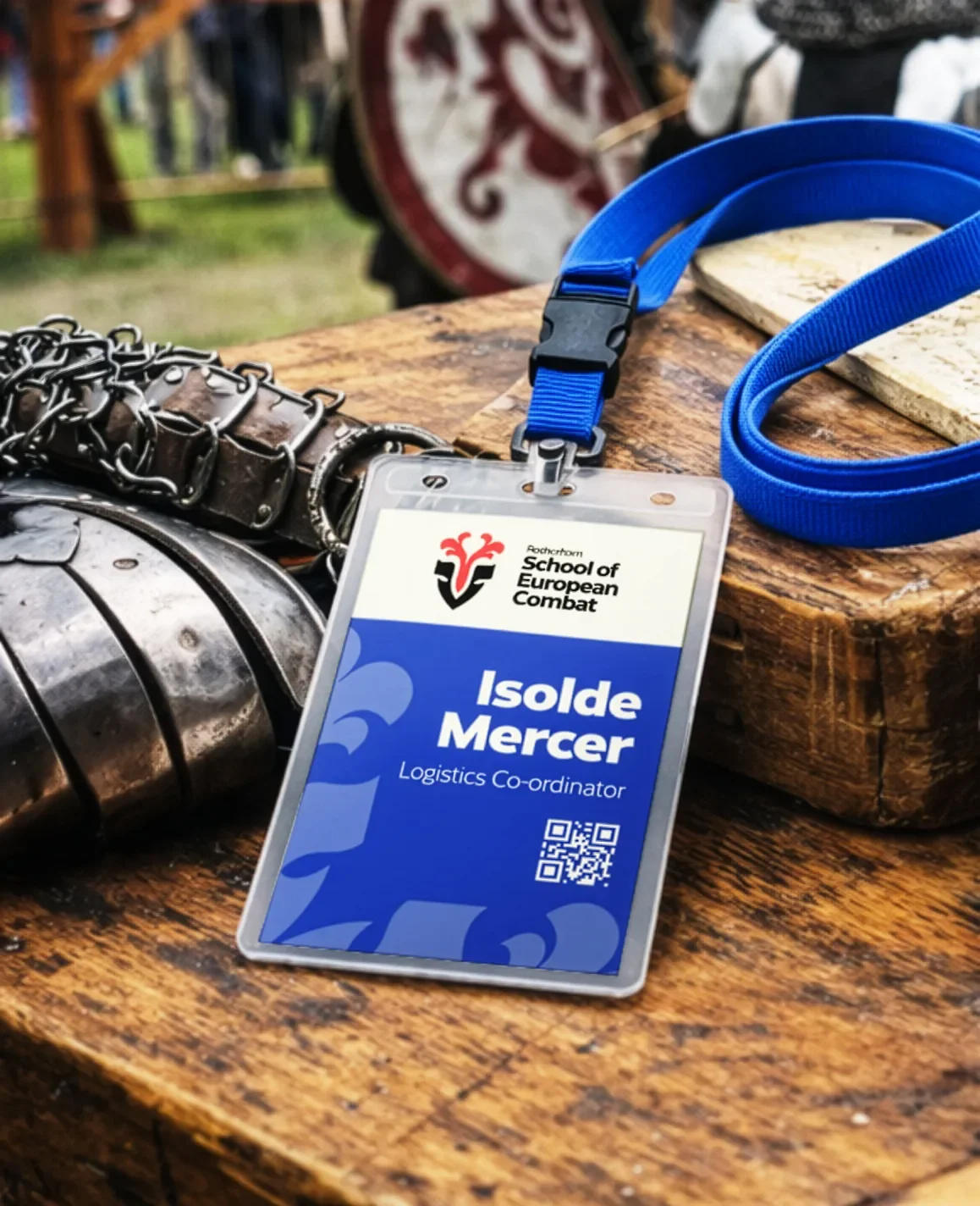
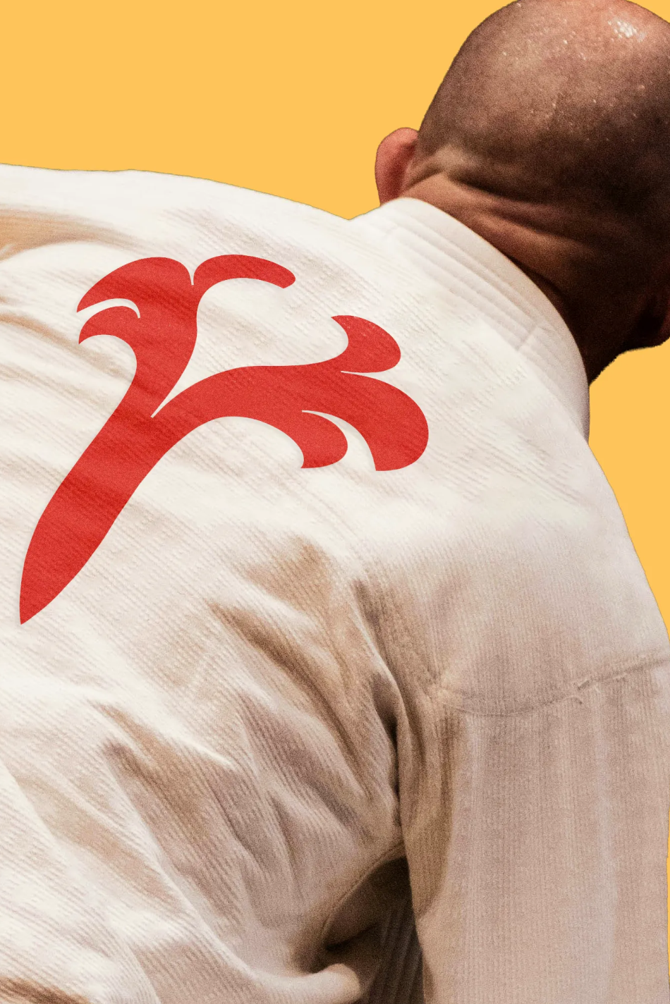
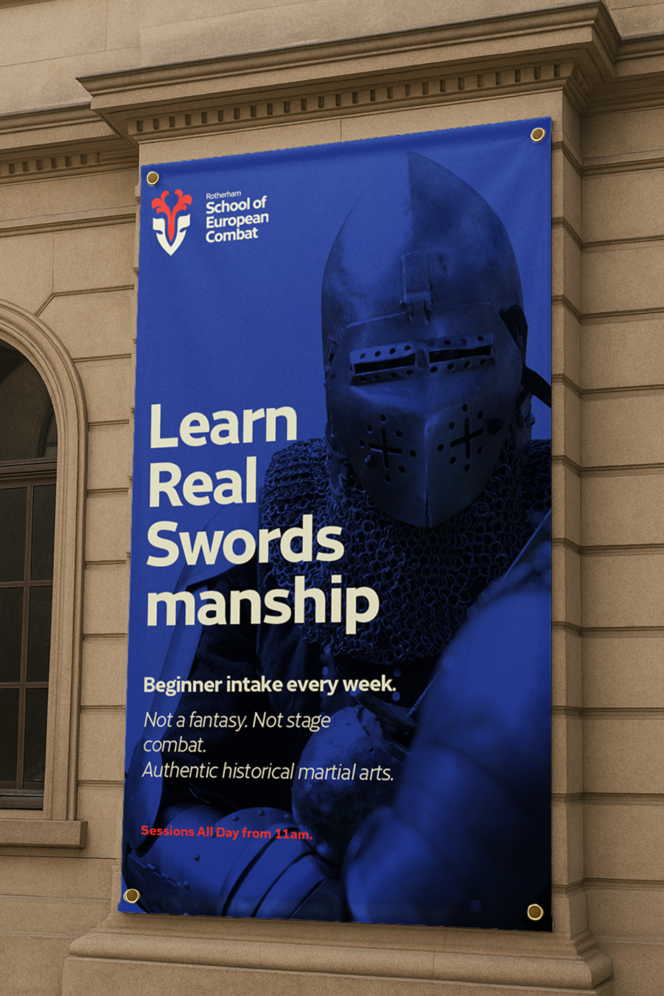
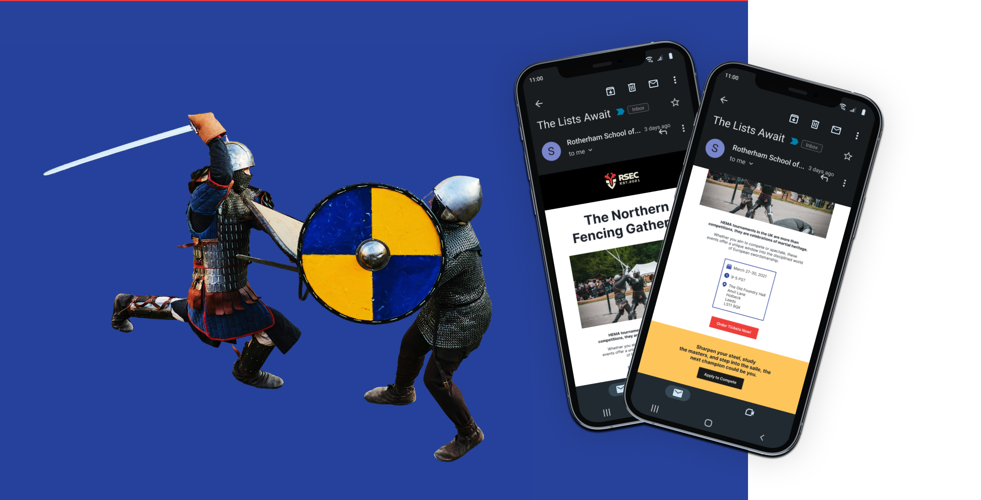
As part of the project I was asked to create various pieces of collateral, from merch to events materials and digital marketing assets. I developed a system for laying out type for print and created templates for marketing emails.